 |
I struggled with this all day today, I had lots of ideas that when it came right down to it, didn't work. I ended up making two cards.
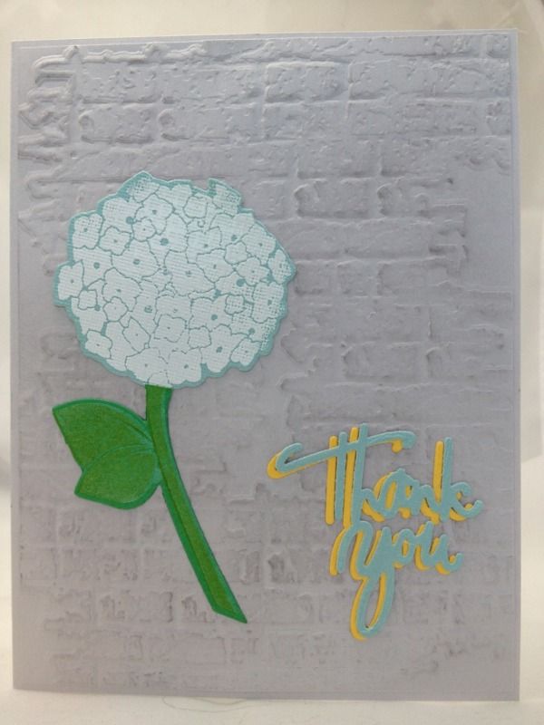
This is the first card I made:
It's okay. What grabbed my attention from the example photo was the back of the grey chair. It looks really cool. I am not sure if it is part of the chair or a throw but I like it.
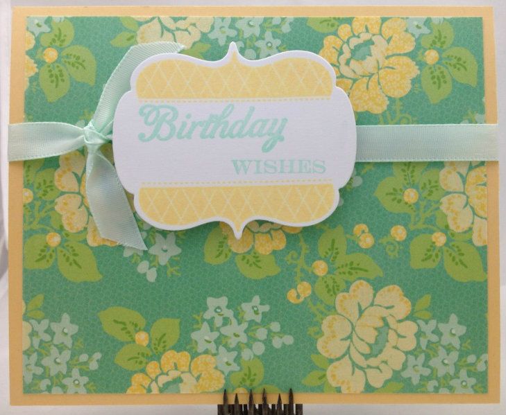
This is the second card:
It okay too. I think it is the color combo I am having trouble with. I really like the Happy Day stamp set though I have used it on almost all of my cards for the last week!
Thank you for stopping by!


Both of your cards are so pretty! I love the patterned paper on your second card!
ReplyDeleteThank you Veronica. The paper on the second card is from DCWV Spring Fling. It has glitter on it that doesn't show up in the pictures.
DeleteLovely cards Tonya, both so pretty.
ReplyDeleteThank you Tracey!
DeleteBoth are pretty Tonya. I had a hard time with the color as well I wanted to add white. Love the second one.
ReplyDeleteThanks Marybeth, I am glad I wasn't the only one! The second one is my favorite too.
DeleteHow'd you do that fabulous background on the second card?? It's awesome! I thought it was paper, but it sure looks like Pretty Peonies?
ReplyDeleteLuanne, it is just one of several pages from the Spring Fling mat-stack from DCWV that look like the PP flowers and this one was close to the example photo colors so I had to use it! Thanks!
DeleteHow observant. I totally missed the gray in the background.
ReplyDeleteAngela I could see how you could miss it with that pretty bright yellow pillow! I just noticed today that the small round pillow had a softer yellow toile like fabric on it.
DeleteVery pretty cards! I'd wondered if someone would use the grey wicker as inspiration-- I love how you did with your first card! And fabulous stamping on your second card!
ReplyDeleteThank you Leigh! I wish I had stamped the background on the second card it is actually a page from DCWV that looked like PP stamps. I will however be trying to stamp that background with that set now! :)
DeleteI didn't like the color combination on the photo either. Love the way you pulled in the chair, I didn't even notice it before!
ReplyDeleteJessica Griffin
http://www.canyoupixelthis.com
This was a tough combo for me. I would really like to know what that is on the chair, a throw? I just want to feel the texture, I keep rubbing picture on the screen but it just feels flat...
DeleteI feel your pain when a great idea doesn't turn out as planned, but both of these look great! I really like the brick background on #1 and the totally different, vintage look of #2.
ReplyDeleteThanks Suzanne! I like the background too and will have to see what else I can use that on.
DeleteBoth cards are lovely! It was a tricky colour combination, but you've done beautiful work with it!
ReplyDeleteThank you Michelle!
DeleteBoth cards are very pretty ~ the patterned paper really captures the inspiration quite well. This one was a difficult one for me also. I usually have too many ideas, and struggled to make just one this time.
ReplyDeleteJean, thank you for the kind words! This one was really weird for me. I had lots of ideas (not usual for me) but once I tried to put them on the card they just didn't work together...
DeleteI especially like the second card. Funny, I never even saw the grey chair. Very pretty.
ReplyDeleteThank you Linda! Nice to see another Washingtonian on here!
ReplyDeleteLove the grey texture on the first card! The second card is such a beautiful floral!!
ReplyDeleteThank you Kara!
ReplyDeleteNice job on both of them. I especially like the patterned paper on the second one. Where did you get it?
ReplyDeleteThanks Terri! The paper is from DCWV Spring Fling Matstack, there are quite a few nice patterns in the pack.
ReplyDelete